The Difference between the Pulse of Attention & Standard Graphs
Introduction
In the prior article we introduced some key features of Information Dynamics, the study that links the Living Algorithm's mathematical system with living behavior. The central notion in this regard is that there is a pulse associated with creative sessions, attention, and changing our patterns of behavior. As such, we suggested that this same pulse could be called the Creative Pulse, the Pulse of Change, or the Pulse of Attention. It turns out that Attention is the common thread linking the diverse manifestations.
The Pulse of Attention
Mechanism behind the Pulse of Attention?
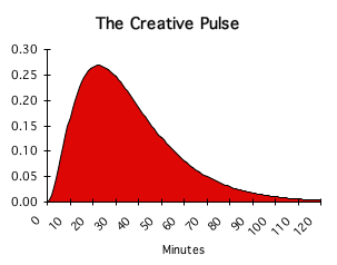
This display to your right is the graphic representation of the Pulse of Attention, a.k.a the Creative Pulse. What unusual mechanism generates this intriguing curve? Is the Pulse of Attention the visual representation of some equation? Or were these graphs generated to illustrate a personal philosophy of life – perhaps derived from insights that occurred while in a deep meditative trance, high on drugs, or in a dream? Or is there some theoretical foundation – perhaps based upon the results of an experiment? Is it instead the result of data points plotted on some chart? If none of these, how exactly does it come into being? What method is employed to generate the Pulse of Attention?
1) Traditional analog Equation of Physics and Calculus.
2) Data Points
3) Imagination
4) None of the Above
As you might imagine the answer is ‘none of the above’. Instead of the traditional techniques the Living Algorithm digests a data stream to produce the Attention Pulse.
Graph 1: Traditional Continuous Graphs (Initial Conditions & Equation)
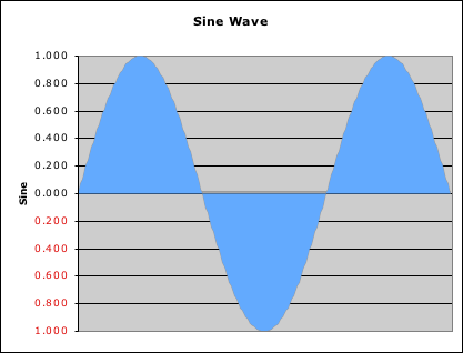
To understand how unique the Attention Pulse graph is, let us contrast its innate nature with traditional graphs. The usual graphs of calculus and physics are based upon initial conditions (a starting point) and an equation. The automatic interaction between these two elements typically generates a graph of a curve or a 3 dimensional surface. Although the equations may have been derived from data, no data (except the initial conditions) is required to generate these graphs. This focus on initial conditions and equation is a powerful method of describing material reality. In fact, this approach is so powerful that many great thinkers optimistically continue to believe that this is ultimately the only method needed to model reality. An example of this type of invariable and automatic graph is shown at right. This graph is the traditional sine wave of Physics that describes many material phenomena, including electromagnetic waves that lie at the heart of modern electronics.
Graph 2: Data Points plotted and linked with curve or line

A second type of graph attempts to model raw data. Points derived from observation or experiments are plotted upon a grid described by an x and y-axis (Cartesian coordinates). Scientists hope to connect these data points with a curve or line that articulates a meaningful pattern. If successful, this type of graph leads to the first type of graph, where equations and initial conditions replace data. This distillation to a type 1 graph is the result that scientists aim for. While this desired simplification is often the case in the hard sciences, it is rarely, if ever, the case with human behavior.
Above right is an example of a type 2 graph. The data points that generate this graph compare the Author’s daily hours of Exercise with his daily hours of Creativity. Then a statistical procedure is performed that provides an equation of a ‘perfect fit’ line that best describes the data pattern. Although the correlation between the perfect fit line and the data point is high, notice how rough the fit is. Although inexact, this descriptive fit is typical of behavioral data.
Graph 3: Imaginary Graph to illustrate Concepts

A graph can also be useful to illustrate certain concepts of the imagination. This third type of graph is not grounded in data and mathematics, but rather uses the graphic process to clarify abstract thinking. The purpose is to visualize key theoretical constructs under investigation. Scientists who generate this type of graph generally hope that experimental data (the 2nd type of graph) and mathematical theory (the 1st type of graph) will eventually substantiate their theoretical claims.
Dr. Flow generated this third type of graph (shown above right) to illustrate his theories about the Flow experience. His graph describes a relationship between the twin abstractions, anxiety and boredom, and visually articulates the Flow experience (the graphic arrow) as a balancing of these competing states. He theorizes that the individual’s pursuit of ever-increasing complexity is the only way to achieve this balance. Oddly enough, the mathematics of the Living Algorithm dovetails with his theory. (These links are discussed in future articles.)
Graph 4: The Living Algorithm digests data streams.
The Pulse of Attention is generated by a distinctly different approach from the standard graphs described above. Initial conditions are marginally significant; specific data points are not plotted; and imagination plays no part. The execution of this approach requires only one algorithm (procedure) and any old stream of data. However, the algorithm is not just any old algorithm. The magnificent Living Algorithm defines this algorithm.
Living Algorithm algorithm describes no inherent curve or shape.
The sole purpose of this procedure is digesting data streams. Because our Living Algorithm is only an algorithm for digesting data, she describes no inherent curve or innate geometrical shape. The data that she is fed determines the graph that is generated. For instance, when the Living Algorithm is fed an uninterrupted series of 1s, the ideal Pulse of Attention is the result. Even though the function remains the same, each data stream generates a unique graph.
Comparing a Random Data Stream with the Ordered Pulse of Attention
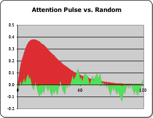
Although any data stream whatsoever can be fed into the Living Algorithm for digestion, we chose to explore what happens when we tweak the rarefied data stream that generates the Pulse of Attention. In the following chapter we will examine what happens when we 'interrupt' this ideal data stream. To get an idea of how concentrated and ordered the Attention Pulse graph is, let's compare it to a graph generated by random numbers. The ideal Pulse of Attention is generated from a data stream consisting solely of 1s, while the random part of the graph is generated from a data stream consisting of 1s and 0s, but in an arbitrary sequence. In the picture at right the random curve is laid over the Attention Pulse (the red curve). It is easy to see how different they are – one with a smooth red curve that soars high, while the jagged green curve appears chaotic, almost tortured.
Notice how the Pulse of Attention (the red area) rises to nearly four times the height of the curve generated by random data (the green area). This is due to the fact that a regular sequence of 1s is necessary to create the rise in the curve. As we will see in other papers, this differentiation between an ordered and a random signal is a key evolutionary feature. This feature allows the organism to distinguish a meaningful signal from environmental noise.
It is evident from this discussion that the Living Algorithm's method of digesting information produces graphs that are unique to her mathematical system.
The Living Algorithm digests Data Streams; Electronics processes Data.
A difference between digesting and processing data
The Reader may have noticed that we have used the word ‘digest’ rather than ‘process’ to describe the Living Algorithm’s algorithm for dealing with data. This choice was deliberate, as there is a significant difference between the Living Algorithm algorithm and the traditional algorithms for dealing with data. The Living Algorithm digests data, while the standard procedures of science, notably electronics, process data. Processing and digesting data have enough similarities that it is easy to confuse the two. Indeed, the two procedures overlap in their functions. However, the two approaches to data are as different as night and day.
Food Processors vs. Biological Digestive System
The prime point of departure between the two procedures has to do with entropy. Digesting data is an inherently entropic process, while processing data is not. To understand this idea, let’s examine the difference between food processors and our digestive system. Food processors chop up a variety of consumables into very small parts, but each component still retains its identity. If a man is allergic to nuts, he avoids the resultant mixture, no matter how fine the nuts are ground. In contrast, our stomach’s digestive process eliminates the food’s individuality. This elimination of the apple nature of a piece of fruit transforms the apple’s substance (its raw data) into a more meaningful form for the organism. In other words, the body’s digestive process transforms environmental edibles into a form that nourishes the body.
Electronic data processing translates without losing individuality.
In like fashion to the food processor, electronic processors translate the information contained on CDs into words, music, or movies. This translation does not compromise the data contained on the CD. In fact, we hope, even expect, that the translation is as exact as possible – no degradation please. Similarly, when one language is translated into another, we hope that the word-for-word correspondence is precise, or more importantly that the translation conveys the exact same meaning as the original words. The translation process should not entail a loss of individuality.
Living Algorithm’s data digestion sacrifices precision for meaning.
In like fashion to our digestive system, the Living Algorithm’s digestive process transforms data streams into a form that is more meaningful to the organism. This transformation entails a loss in precision. The data loses all individuality once it is tossed into the Living Algorithm. This inherent information loss is a feature of entropy. For example, although a blue data stream loses its individual character, it now becomes part of a more meaningful picture, perhaps the shadow on a woman’s dress. A practical infinity of data streams must lose their individuality to convey the meaning of this dress.
Living Algorithm’s data digestion is entropic: Electronic processing not.
Reiterating for emphasis: digesting and processing data are very similar. However, there is a significant difference. Processing data entails translating data from one form to another without a loss of precision or individuality. Digesting data entails transforming data into a more meaningful form. This transformation process eliminates the individual nature of the data points. Rather than raw precise data that is indigestible, the Living Algorithm provides digested information that nourishes and informs the organism.
The Pulse of Attention: a visualization of the Living Algorithm’s digestive process
Due to these distinct differences between the two procedures, we will continue to say that the Living Algorithm digests data, rather than processes it. Further, our graphs visualize the results of this digestion process. For instance, the Pulse of Attention is a result when the Living Algorithm digests a data stream consisting of 120 1s. In other words, the Living Algorithm transforms an uninterrupted sequence of 1s into a meaningful curve with widespread implications for human behavior.
Conclusion & Links
In the prior articles, we met the Pulse of Attention, first as a concept and then as a graph. We also learned that the Pulse of Attention is no ordinary graph. It is not the result of the traditional equations of Physics with their initial conditions. Nor is this attractive curve produced by experimental data or some theory of behavior. Instead, the Pulse of Attention is a result when the Living Algorithm digests a data stream consisting of an uninterrupted sequence of 1s. The fact that this Pulse of 1s is not generated in the usual fashion raises some interesting questions.
What is its applicability to human behavior? Or better yet, how do we establish this connection? Is it even valid to speak about correspondences with an equation-less graph? What does it mean? What methodology is employed to establish verifiable links with behavioral reality? What is the tao behind our study? What procedure did we employ to come up with our results? Did we just dream everything up in a moment of Divine Inspiration or is there a method to our madness? For some preliminary answers read the next article in the stream – The Cell Equation’s Visual Methodology.
Or perhaps this Left Brain discourse has tired you. Maybe you're ready for a Right Brain break. If the emotions that are driving our exposition interest you, check out the article from our parallel universe. See why Life is skeptical of Living Algorithm’s Visual Methodology.